Each of our Problemotional Advertising articles are written in a sequence. We strongly recommend reading them from Article 1 to the most recently published. This will ensure you understand everything you need to create a profitable and scalable B2B advertising campaign and avoid wasting hundreds of thousands of dollars.
Disclaimer: If you believe that B2B should be mind-numbingly boring and painful, you will experience extreme discomfort by reading the following article. Continue at your own risk.
Written by Dylan Ciaccio and Regan George
Dear CMO,
When was the last time you genuinely enjoyed watching a B2B ad?
Do you remember any ads from last week? From yesterday?
If you do, it’s likely that it was a Problemotional Ad – an ad that markets a painful problem in an emotional way.
But if you don’t remember them, it’s because they were Attention Repellent Ads.
Ads that are 1) mind-numbingly emotionless and 2) shove their service in your face.
And they get sent straight to Ignoredville.
Never consumed. Never remembered. Never influencing your buying behavior.
Except of course for the too-frequent occasion where it actually negatively influences buying behavior.

That’s because the human brain in 2024 is suffering from Ad Overload.
Ad Overload became a problem back in the 70’s, when the godfathers of positioning started evangelizing the phenomenon. But its impact has never been so strong.
In 2024, if you use Attention Repellant Ads you can’t cut past the Ad Overload barrier.
So…
How do you diagnose the Attention Repellent Ads Virus?
Attention Repellent Ads Virus is a Hierarchically Transmitted Disease (HTD).
It spreads from the top to bottom – from C-Level to the ones creating the ads.
And if you don’t use protection, the whole ad campaign will catch it.
Symptoms include irritated CFO, swelling of ad spend, and in many cases, painful death of marketing budget.
Because it’s hierarchically transmitted, it’s important that you, the CMO, understand the details.
If you don’t and you let Simon The Intern (STI) decide what ads to make, there’s a 98.7% chance he will recommend using an AR Ad.
An advertisement has 2 components:
- What is said (The Message)
- How it’s said (The Medium)
You can recognize an Attention Repellent Ad when:
- The Message leads with the brand or service (described as a solution)
- The Medium communicates with emotionless webinars, ebooks, and stock photos
You can recognize a Problemotional Ad when:
- The Message leads with the painful problem
- The Medium communicates with emotional videos, gifs, and images
The former should not be used in Top of Funnel ads (the first interaction with buyers). The latter should.
In this article, we’ll first break down examples of Attention Repellent Ads into 1) The Message and 2) The Medium. Then break down examples of Problemotional Ads. By the end, you should be able to understand the structural difference to make sure your marketing team is creating the right creatives for your B2B ads campaign.
The Message
AR Ads say, “We’re the best” despite everyone else saying the same thing.
AR Ads say, “Look at my logo 500 times” as if a logo will convince buyers to spend $50k.
AR Ads say, “Look at my solution” without first addressing the problem
AR Ads say, “Here’s our webinar on {vague topic},” without anyone knowing you.
These types of ads are sent to Ignoredville because no one cares about your solution, UNLESS they first understand it in relation to the problem. Problems get attention, prioritization, and urgency.
Let’s take a look at some AR Ads examples analyzing their message. If they look like your Top of Funnel ads, consider this your AR Ads Virus test….

Attention Repelling Message Type 1: Leading With The Brand
“The copy in most corporate advertisements is distinguished by a self-serving, flatulent pomposity which defies reading.” – David Ogilvy
Example #1
Message: Look at us! Look at our brand. We’re different.
Viewer Response:
I don’t know you.
I don’t care about you.
I care about me and my important/urgent problems.
→ Ignoredville.

If you have to say you’re different, then it’s probably coming from the subconscious insecurity that you’re actually not.
Shall we call this Business Overcompensation? 🤏
But when you market a problem, you’re automatically seen as different.
When the rest of the players in your category talk about themselves, be the brand that talks about customers and what they care about – their painful problem.
p.s. Take a look at the ad copy. Is there any company that isn’t committed to “excellence”? If what you say can be said by anyone, it means nothing.
Example #2
Message: Here’s our logo. And a generic, vague, and fancy sounding phrase.
Viewer Response:
I don’t know you.
I don’t care about you.
This means literally nothing to me.
I care about me and my important/urgent problems.
→ Ignoredville.

These kinds of messages make you feel like a badass.
“We’re creating a revolution.” “The new frontier.” “We’re striving for greatness.”
But the ad message isn’t supposed to make you feel good.
It’s supposed to influence buying behavior and drive revenue.
Keep the ego out of it.
Example #3
Message: Here’s our logo. Plus a generic, vague, and fancy sounding phrase.
Viewer Response:
I don’t know you.
I don’t care about you.
This means nothing to me.
I care about me and my important/urgent problems.
→ Ignoredville.

Attention Repelling Message Type 2: Leading With The Service
“No one buys a solution unless they have a problem.” – Christopher Lochhead
Here’s the thing about services.
No one buys them.
They buy solutions to problems.
Your service only becomes a solution in the buyer’s mind when they’re aware of the problem it solves.
And if your B2B ad campaign uses Top of Funnel ads to make the service the main message, skipping the problem awareness stage, the rest of your funnel will not work.
Marketing the problem and owning the problem in the buyer’s mind is the purpose of Top of Funnel ads.
Because when you own the problem in the buyer’s mind, you’re perceived as the only obvious solution for it.
And that’s when your BoF advertisements do its magic.
Example #1
Message: We have solutions.
Viewer Response:
Solutions to fucking what?
What problem does it solve?
Or do you just want to sell me something and take my money?
I care about me and my important/urgent problems.
→ Ignoredville.

A common practice in B2B is to list a whole bunch of random services and call them ‘solutions’.
The thought behind here is, ‘The more services we have, the more likely they’ll buy something from us’.
But in the buyer’s mind, what this is saying is, ‘We don’t stand for anything. We don’t really understand your problem. We just really want your money.’
Example #2
Message: We do {extremely general category of service}.
Viewer Response:
Why should I care?
There are thousands of others that do that same thing.
Why do I need that service?
What problem does it solve?
I’ve got more pressing matters.
→ Ignoredville

A common practice in B2B is to list a whole bunch of random services and call them ‘solutions’.
The thought behind here is, ‘The more services we have, the more likely they’ll buy something from us’.
But in the buyer’s mind, what this is saying is, ‘We don’t stand for anything. We don’t really understand your problem. We just really want your money.’
Attention Repelling Medium Type 1: The Webinar
“You cannot bore people into buying your product, you can only interest them into buying it.” – David Ogilvy
If your Top of Funnel Ads send viewers to a webinar, you’re not alone.
That’s because it’s a seemingly logical thing to do from our point of view.
When buyers go to our webinar:
- we get their email addresses
- we build trust and rapport
- we show that we’re experts
- more time is spent educating on our solution
- they become ‘warm’ leads
But here’s the thing.
This is all based on the assumption that people want to watch your webinar.
Have you ever said to yourself:
Aw gee, you know what I could really go for right now? Spending an hour of my precious time listening to a complete stranger with a shitty microphone talk about something I could have learned from ChatGPT in 2 minutes. God do I love webinars.
If you haven’t, why do you think others would?
Example #1
Message: Here’s our webinar on {extremely generic vague topic that you can find on ChatGPT}
Viewer Response:
I don’t know you.
I don’t care about your webinar.
I’m not risking an hour of my time on something that isn’t urgent/important.
And what’s urgent and important are my problems.
→ Ignoredville.
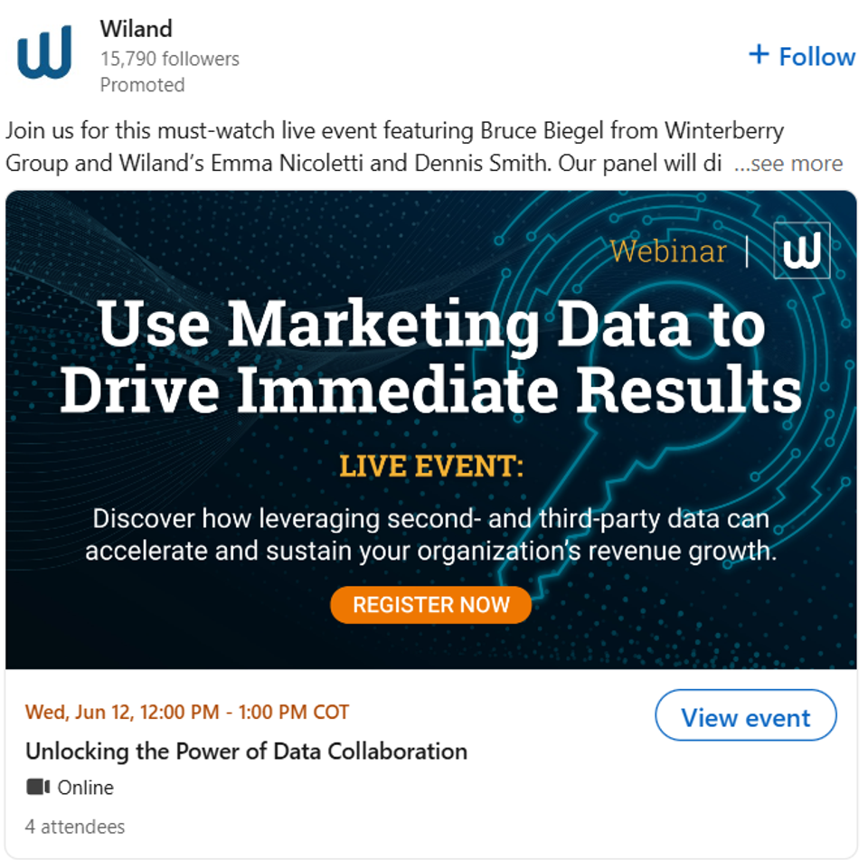
p.s. Who do you think the 4 attendees are? We can take a guess. Rhymes with ‘the marketing team’.
Example #2
Message: Here’s our webinar on {extremely generic vague topic that you can find on ChatGPT}
Your Response:
I don’t know you.
I don’t care about your webinar.
I’m not risking an hour of my time on something that isn’t urgent/important.
And what’s urgent and important are my problems.
→ Ignoredville.

Attention Repelling Medium Type 2: The eBook
“Content is king, but is god.” – Gary Vaynerchuk
Another commonly used medium in ToF B2B ads is the eBook.
Again, this one seems pretty logical. Give something valuable in exchange for an email and phone number. Bing, bam, boom. Leads. Generated.
That’s at least what the 2000 blog articles about ad funnels on Google tell you.
Fun fact: 1 in 1000 of those ‘leads’ actually close. Few signup. And even fewer actually close.
Just like the webinar, most eBooks are shit and and are both physically and mentally painful to read.
Most people know this. And scroll right by.
You can give valuable content, but the context matters. It doesn’t matter if your eBook is valuable. What matters is if the ad audience will perceive it as valuable.
And if it’s the first thing they see from you, they will not perceive it as valuable.
If you’ve just met someone, what’s the first thing you would do? Certainly not hand them a book.
If a stranger tries to take even just 10 seconds of your time on the street, you get pissed off.
Do you really think people want to read a 1-hour eBook from a complete stranger on an extremely vague topic?
Attention Repelling Medium Type 3: The Stock Photos
“Advertising people have an unconscious belief that advertisements have to look like advertisements. They have inherited graphic conventions which telegraph to the reader, ‘This is only an advertisement. Skip it.” – David Ogilvy
In 2024, where buyers are experiencing extreme Ad Overload even more than when David Ogilvy wrote the quote above, the key is to NOT look like an ad.
And yet, it seems like so many B2B ads were designed with the sole purpose of looking like an ad.
The #1 way to look like an ad is to use stock photos that everyone else uses.
Stock photos themselves are not the problem.
They’re a great cost-effective graphic design alternative.
It becomes problematic when they use stock photos that everyone else uses, making it look like an ad while also looking like everyone else in your category.
This kind of stock photo says:
- This is an ad, skip it.
- We’re exactly just like everyone else in our category.
Example
Medium: Stock photo that everyone in category uses.
Your (Subconscious) Response:
That is 100% an ad.
0 value in it for me.
0 difference from any of the other 1000 cybersecurity brands.
Ciao.
→ Ignoredville

By now, you should have a good understanding of what an Attention Repellent Ad looks like.
If you’ve got the AR Ads Virus, Problemotional Ads are the medicine.
Let’s break down a few examples of Problemotional Ads.
Problemotional Ad Example #1
Message (the problem): Website design platforms glitch, stop working for unobvious reasons, and cause extreme frustration trying to figure out why and how to fix it.
Medium (the emotion): Video that uses relatable and funny metaphors to communicate the message.
Viewer Response:
“OMG that is exactly how it feels!
These guys totally get it.
It’s so annoying when that happens.
Finally, a website design platform built to solve that problem!”
Those are the exact words describing the ad from a web design agency owner we know.
She shared this with us YEARS after having first seen it.
Talk about being memorable.
→ Outcome: perceived and remembered as the Irreplaceable Need-To-Have solution to the problem
Problemotional Ad Example #2
Message (the problem): Your workers waste tons of time and resources to have unproductive in-person meetings.
Medium (the emotion): Video that uses relatable and funny antagonist characters to communicate the message.
Viewer Response:
Ha! Yes! There’s always that one guy that wants to make a meeting for everything.
What a waste of time for everyone.
We’d be so much more productive if we could avoid them.
→ Outcome: perceived and remembered as the Irreplaceable Need-To-Have solution to the problem
Problemotional Ad Example #3
Message (the problem): Taking notes and updating your CRM manually is frustrating and inefficient.
Medium (the emotion): Video that uses relatable and funny victim characters to communicate the message.
Viewer Response:
I’ve always felt that way with my CRM!
I never knew there was something to solve that problem.
They totally get it.
Totally need to share this with {coworker name}. We’ve always complained about that.
She’d think this is hilarious.
→ Outcome: perceived and remembered as the Irreplaceable Need-To-Have solution to the problem
But how does this affect revenue? How are these ads the difference between Ad Budget Waste and Ad Campaign Success?
By now you should understand the difference in the message and medium between AR Ads and Problemotional Ads.
But perhaps there’s still a few questions in your head…
“We’re using AR Ads, yes, but it takes time and money to make the change.
Does it really have that much of an impact on our ad campaign?
How does it affect revenue?
Even if I agree that we shouldn’t use AR ads, how do I show the rest of the team how important it is?”
In the next 2 articles, we show you how the difference between AR Ads and Problemotional Ads in terms of financial outcomes.
To be published soon…
